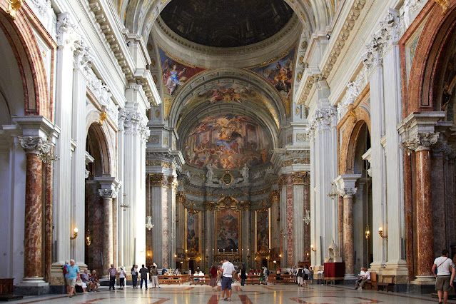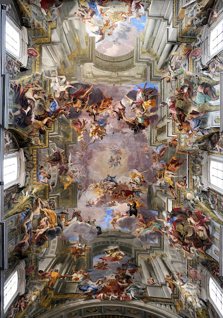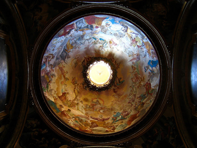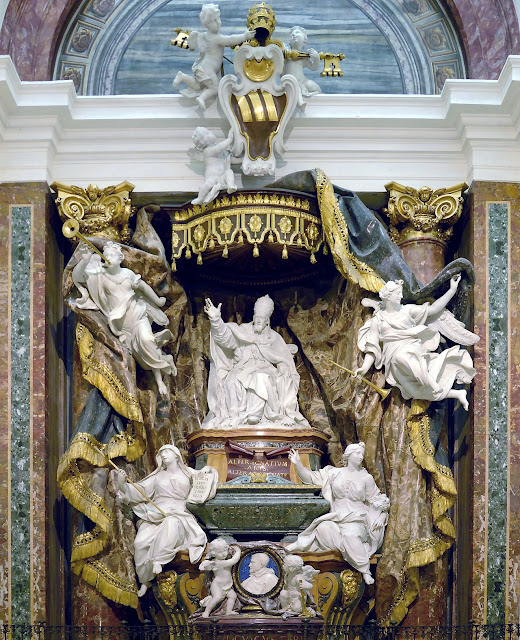
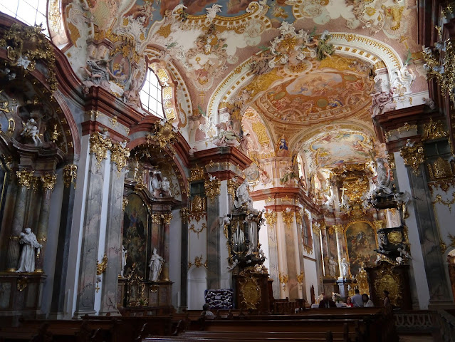
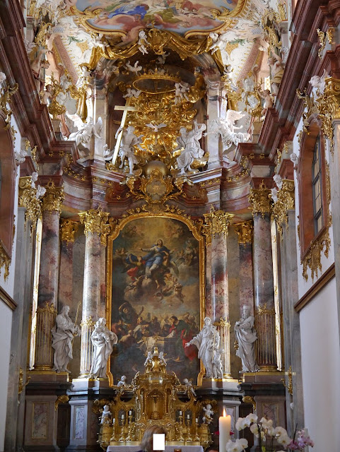
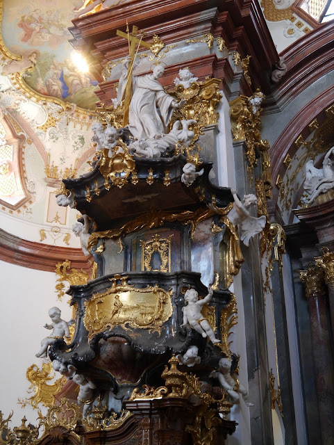
There are plenty of similarities between baroque and rococo but there are also key differences to help distinguish them. Baroque is sometimes characterized as the "masculine" expression of the two and Rococo the "feminine." Baroque art was intended to inspire and draw upon emotion -- and one will see this especially in baroque paintings found on the ceilings and in the domes of so many baroque churches, as well as in its sculpture. These figures seem almost alive; they are dynamic and in motion -- rather than static or classically serene. One can think here of windswept robes, or emotive actions and gestures frozen midstream in time. The baroque movement too loved to play with perspective and illusion -- trompe l'oeil -- as well as light and darkness. Baroque works also favoured gold gilt decoration, frequently paired with neutral colours.
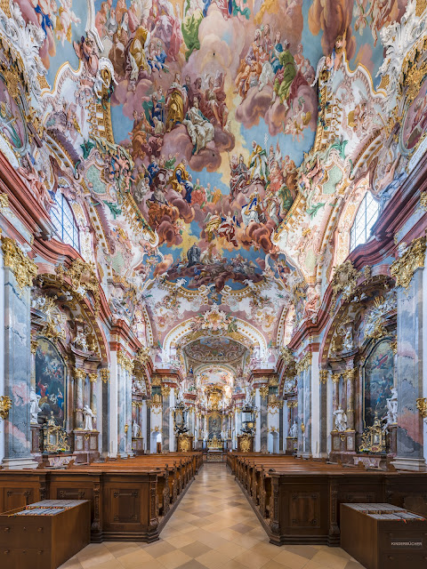
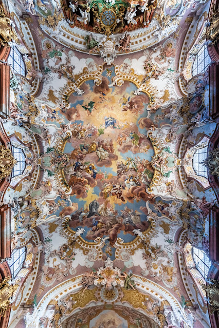
Turning toward the Rococo, we see this softened, especially in terms of the palette. Softer, pastel colours -- used quite liberally -- came into vogue. This was seen especially in the painting, but also in the selection of pastel coloured marbles. Rococo too was very ornamental, in fact one might say it was even more ornamental than the baroque, but in this slightly different, softer, more feminine expression. One might say that whereas the baroque focused on emotion and contortion, the Rococo focused on playful serenity.
If our readers want a quick way to try to ascertain whether a particular church might be baroque or Rococo, one of the best places to start looking is at the colour palette. If you are seeing light and dark marbles with gold gilt decorations and contorted, illusionistic painted figures and scenes in brighter and darker colours, you're likely looking at baroque. If, on the other hand, you're seeing soft pastel colours in abundance, from the painted works to the marbles themselves, with figures more playful and delicate rather than emotive, you're quite likely looking at something Rococo.
Here are two examples which might help to illustrate some of these differences.
Rococo - The Abbey Church of Wilhering, Austria

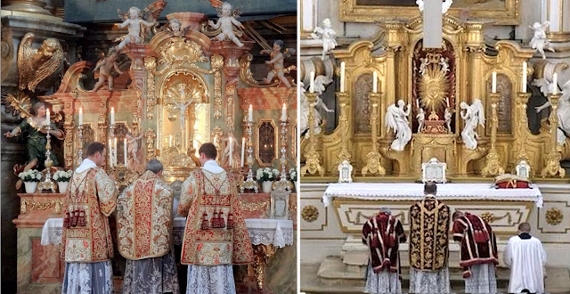
While not from this same abbey church, here is a look at the sacred liturgy offered within a Rococo context:
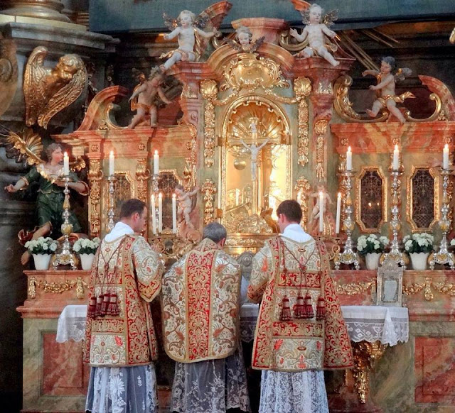
Baroque - Sant'Ignazio, Rome