


About the Author: Marco Foppoli is a well known professional and international heraldic artist. In his thirty-year career he has designed coats of arms for royals, public institutions, and countless bishops, cardinals of the Catholic Church. He collaborates with the Presidenza del Consiglio dei Ministri of the Italian Republic in the design of the civic coats of arms granted by the President of the Republic. For his qualified work he has been received as a Member and Fellow of the most authoritative international associations dedicated to heraldry.
* * *.
The Decadence of Contemporary Approaches to Papal Heraldry
by Marco Foppoli
Anyone who practices institutional communication and professional graphic design, when looking at the official rendering for the coat of arms of Leo XIV cannot help but notice the objective graphical impoverishments that have unfortunately come to be considered a distinctive feature of contemporary papal heraldry. These designs are frequently characterized by their lack of awareness (or even indifference) toward the formality and quality that institutional symbols and coats of arms demand, being as they are symbols of respect and prestige for the institutions or personage that they are intended to represent.
For centuries, papal heraldry had been entrusted only to artists who made it an instrument for the institutional representation of the Pontiff and an element of liturgical beauty within the Church. Anyone who searches amongst the coats of arms of Pius XII will not find any lacking in artistic quality, for all of the artists, decorators and engravers in the service of the Holy See all served the Pope with their professional talents and skills.
 |
| Arms of Pius XII |
After Pius XII, papal heraldry encountered a rather more eccentric character, one without precedent: the Swiss Archbishop and Apostolic Nuncio, Bruno B. Heim, was an important prelate of the Curia who had a solid expertise in the discipline of heraldry and also the talent and graphical and artistic skills to translate his knowledge into correct and aesthetically appreciable drawings. Heim thus designed over the course of his years the coats of arms of four pontiffs, John XXIII, Paul VI, John Paul I and John Paul II, as well as those of the senior bishops and cardinals of those pontificates.
 |
| Arms of John XXIII and Paul VI by Monsignor Bruno B. Heim |
He consciously operated a true “Rinascimento araldico,” maturing and bringing to the official arms of these popes a style that was certainly more “simple” and streamlined, abandoning the redundant heraldic models of “Baroque Rome” or those of the eclectic nineteenth-century style; styles that are arguably less suitable to modern visual communication. But Heim’s work remained distinguished by its dynamic, vigorous traits, which never lapsed into the banal or the simplistic; it was a competent work which maintained solid graphic standards that the author, having had the honour of being a friend and student of Monsignor Bruno B. Heim, was able to know and appreciate over the years.
 |
| Arms of John Paul I and John Paul II by Monsignor Bruno B. Heim |
Insignia of papal dignity are unique; the ancient heraldic tradition of the popes, therefore, did not need the support of legislation. The Popes have acted so consistently in this regard as to render law quite superfluous (…). The classical elements of official papal achievement have been maintained for more than five centuries, during which they have never been changed.
Thus, the tiara was eliminated from the coat of arms of Benedict XVI, a choice which is difficult to know if it really reflected Benedict's XVI's own personal desires, or if he simply opted to bow to the will of those around him. Whatever the case, what the present author can attest to was that, in those days, I was given the task by the prelates of the Pontifical Household and the Secretariat of State who were against this innovation, to design alternative models of the coat of arms in an attempt to save the papal tiara, designs that Benedict XVI only was able to finally see just before Montezemolo's innovations were presented by the Corriere della Sera. Thus, any possibility of more thoughtful evaluations were unfortunately too late and the elegant papal tiara, rich in history and meaning, was replaced by the unusual and strange three-striped mitre that had been invented by Montezemolo.
 |
| Official arms for Benedict XVI by Cardinal Montezemolo |
 |
| Proposed arms for Benedict XVI by Marco Foppoli |
Over the years, the objectively modest work of Montezemolo has had the unfortunate side effect of influencing many observers -- observers not educated in the domain of heraldry -- to consider these works as somehow normal and acceptable. However, if his Manual of Ecclesiastical Heraldry can be considered representative, his designs for the arms that it illustrates showcase a very lack-lustre gallery -- for example, the tassels in a bishop's or cardinal's arms have been reduced to rigid "skittles" [a shape akin to the bowling pins], while the bear within Benedict XVI's arms is drawn more like a tapir.
 |
| A detail showing the 'bear' / tapir within Benedict XVI's arms by Montezemolo |
 |
| See the rigid skittle like shape given to the tassels by Montezemolo |
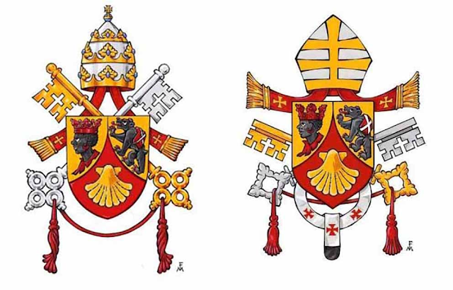
After Montezemolo, the decline in the quality of the renderings of official papal arms has been a seemingly unstoppable force and the coat of arms, first of Francis and now again of Leo XIV, have declined yet further still -- something that many professional heraldists and scholars of ecclesiastical heraldry have noted amongst themselves, observing as they have the poor stylistic and graphical execution of these works, something without historical precedent for something so important as papal arms.
So what then are the issues of concern? The official design appears dull, sparse, not only lacking any artistic flair or conscious style but also produced in a rigidly outlined, generic computer “clip-art" style typical of the sort of heraldry one might expect to find on Wikipedia; heraldry that is flat and rigid. In the hand-drawn version of the arms, an elementary colouring can at least be observed, though it is not even painted; rather it has been outlined with marker and with the details that appear to have been made without especial care or attention. (Observe, for example, how in the arms of Leo XIV the red arrow of the Augustinian heart effectively disappears from sight because it has been placed, with inexperience, over the too similarly coloured cover of the book.) The net result in all of this is a coat of arms devoid of graphical vigour, soul-less and bland, and with no particular evocative force; an unsuccessful assemblage of dissimilar elements taken from different originals: the mitre of Benedict XVI's arms, the keys of Pope Francis, the shield of Cardinal Prevost, not to mention the butter-colored field that is inexplicably different from the silver coloured fleur-de-lys, a dissimilarity that is due, it would seem, to the very rare and completely exceptional heraldic cases of the insignia of ecclesiastical orders that, in this case, simply needed to be corrected.
 |
| Official arms of Francis and Leo XIV |
To justify the evident design issues that have been noted here, issues that are now subject to wider spread criticisms amongst the heraldic community, the all too convenient and cliched principle of “simplicity" is invoked. The problem is that simplicity is one thing and sloppiness is another and, what's more, this appeal to simplicity rings rather hollow as the beauty of a well-designed papal coat of arms does not, materially, enrich anyone, nor does it deprive the poor in any way.
So then, in reading the rare, but overly enthusiastic comments sometimes made about these contemporary arms being a “heraldic masterpiece,” the claim that they somehow reflect “the sovereign will of the Pontiff” once again overshadows the discussion -- an all too common counter-argument employed in these cases in order to silence any legitimate, constructive criticism from the heraldic community. If it is legitimate to doubt this as reflective of a conscious, purposeful decision on the part of the pontiff, then it is not clear why the Pope, in his episcopal and cardinalatial coats of arms, maintained the silver field common to the fleur-de-lys and, in the papal one, he would request it be in white. But even if this is in fact the case, it must also be simply noted that the Pope is obviously not a professional heraldist and as such, the Pope would be best served by experts advising him on these matters.
Indeed, due to the heraldic challenges of the original arms -- that is, the shield being divided in an asymmetrical, triangular way in an art that lives and breathes off symmetry, harmony and a horror vacui -- a competent heraldist would have advised the Holy Father to divide his shield symmetrically in a horizontal direction instead. In this way, two regular and symmetrical partitions would be obtained in which you could then insert the symbols found in his arms. (Even an open version of the book might have been considered as it would have made that symbol even more interesting as well as evoking the image of an instrument that communicates.)
 |
| Three proposed variants of the Leonine arms by Marco Foppoli |
A talented colleague speaking to me these days about the official coat of arms of Leo XIV noted that it is "a particular form of penance that has been inflicted upon we professional heraldists who are able, with a few strokes, to transform that poorer version of his arms into a correct, vibrant and pleasing design." A point of view that can almost be considered heartening.However, always aspiring to beauty and to the evocative and communicative power that is typical of what I personally like to call "la bella araldica," I would like to conclude on a positive note and in the hope of a possible return to better things, by quoting the wise words of the heraldist Archbishop Bruno B. Heim.
Thanks to its brilliant colours, its power of suggestion and the rich language of symbols that it has accumulated, the noble art of heraldry has been a source of deep and mysterious fascination for many peoples over the centuries. However, few truly know its rules, its characteristic style and its peculiar language, because the possession of this knowledge presupposes years of study and intelligent observation.
His words contain two great truths referring to heraldry as a tool of representation, art and decorum of the institutions they represent.
One can only hope that those who see something for what it is, a coat of arms that represents the person of the Pope made in an inadequate way, if they so believe, will feel empowered to criticize them constructively precisely as a form of service to the Pontiff so that he might have an true and authentic papal coat of arms. After all, as G.K. Chesterton said, "Catholics when they enter a church take off their hats, not their heads."
Marco Foppoli,
Académicien Académie Internationale d’Héraldique, Geneve CH,
Wappenmeister Scheweizerische Heraldische Gesellschaft,
Craft Member of the Society of Heraldic Arts (UK),
Fellow of the Heraldic Institute (Germany),
“Artist Companion” of the Confraternity of Our Lady, St. Luke and the White Shield (UK)
-------

Do you like Liturgical Arts Journal's original content? You can help support LAJ in its mission and vision to promote beauty in Catholic worship either by:
You choose the amount! Your support makes all the difference.


